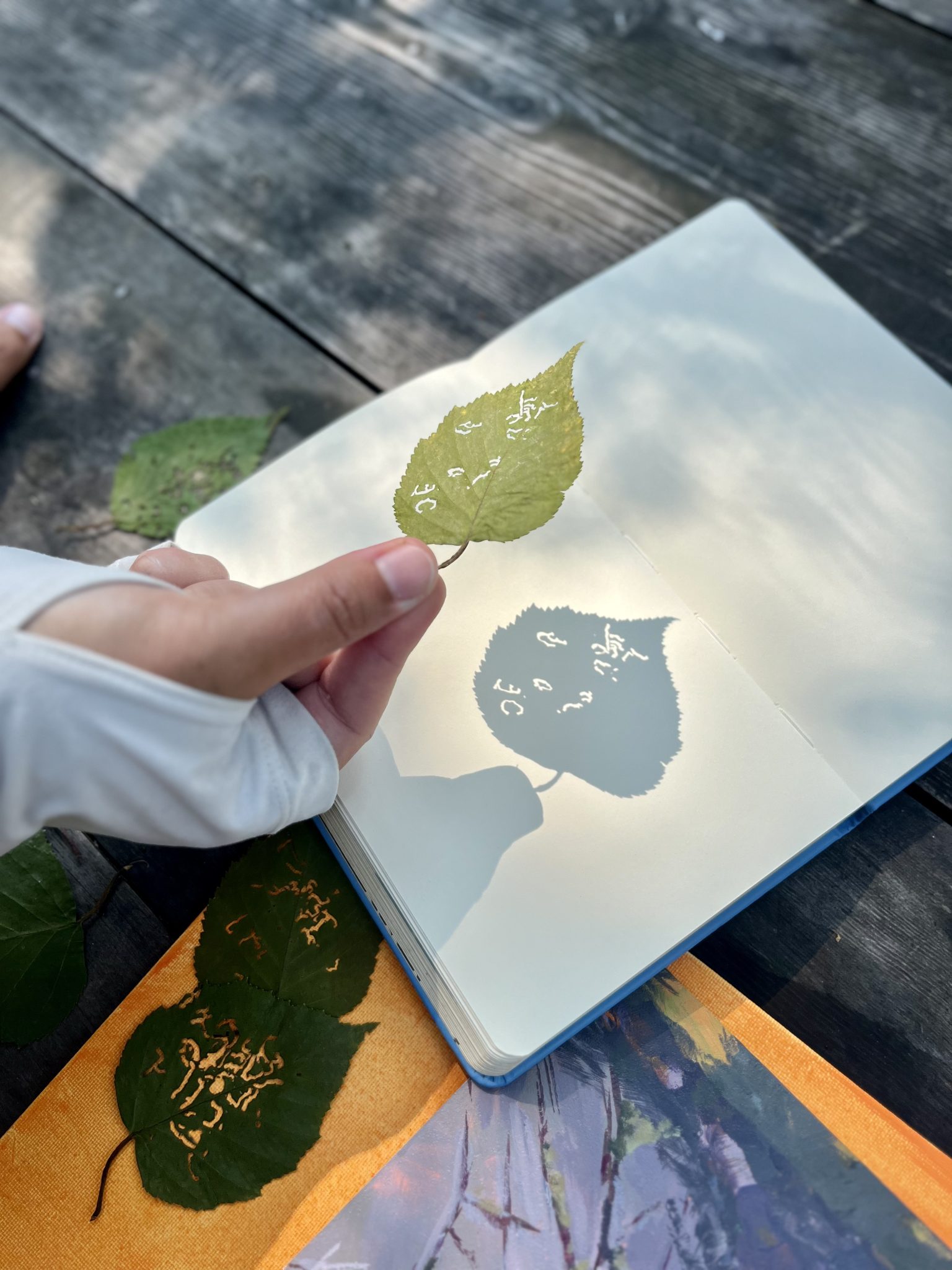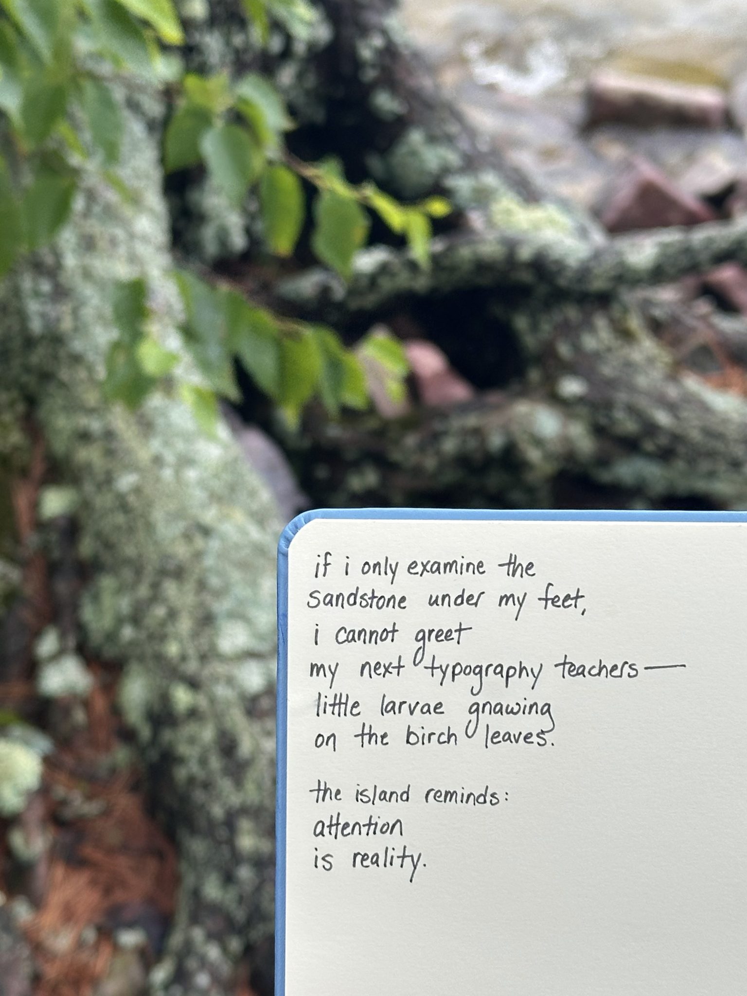
I often think about the elements of language—internally playing with letters and phrases, scanning my physical world for glyphs. My continued research practice of Topography Typography involves glyph detection and typeface creation from physical spaces, ultimately creating place-based fonts. It is my intent with these fonts to keep elements of the physical landscape in the text’s textural experience.
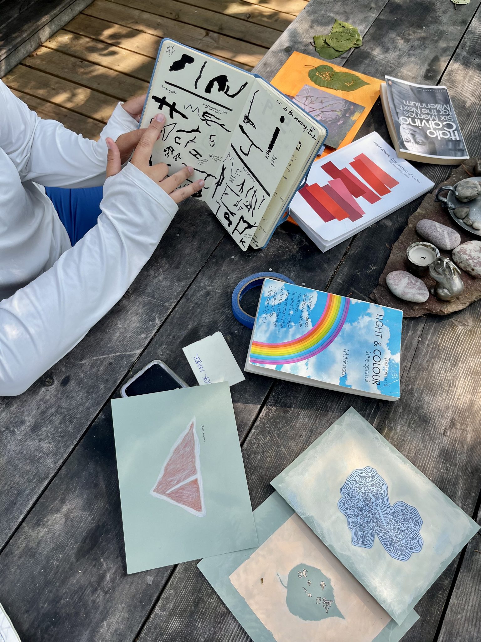
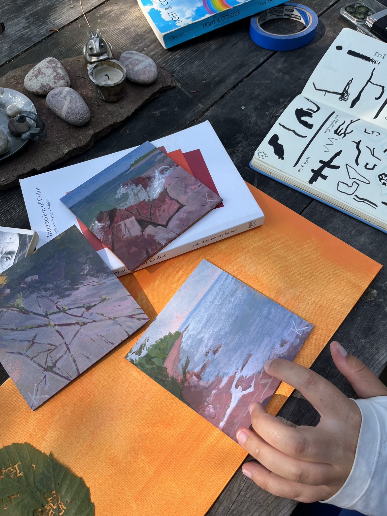
I enjoy watching light. My perception of light shapes my everyday perspectives and helps me feel grounded. I’ve trained my eye to focus on small details: light traveling through water creates dancing caustic envelopes, light hitting building windows creates warped reflections, and light piercing into internal spaces creates graphic shards. These moments are art. I plein air paint to watch how light affects value, composition, and mood while I connect with nature and my local community.
These graphic languages—of typography, of light—keep me searching. Using these languages to help me focus, I dive into intersections of nature, computer graphics, graphic design theory, and experiential education. I’m interested in examining visual and media theoretical patterns while locating and emphasizing poetic moments.
For my artist residency, I propose a typographic exploration of Rabbit Island which likely includes:
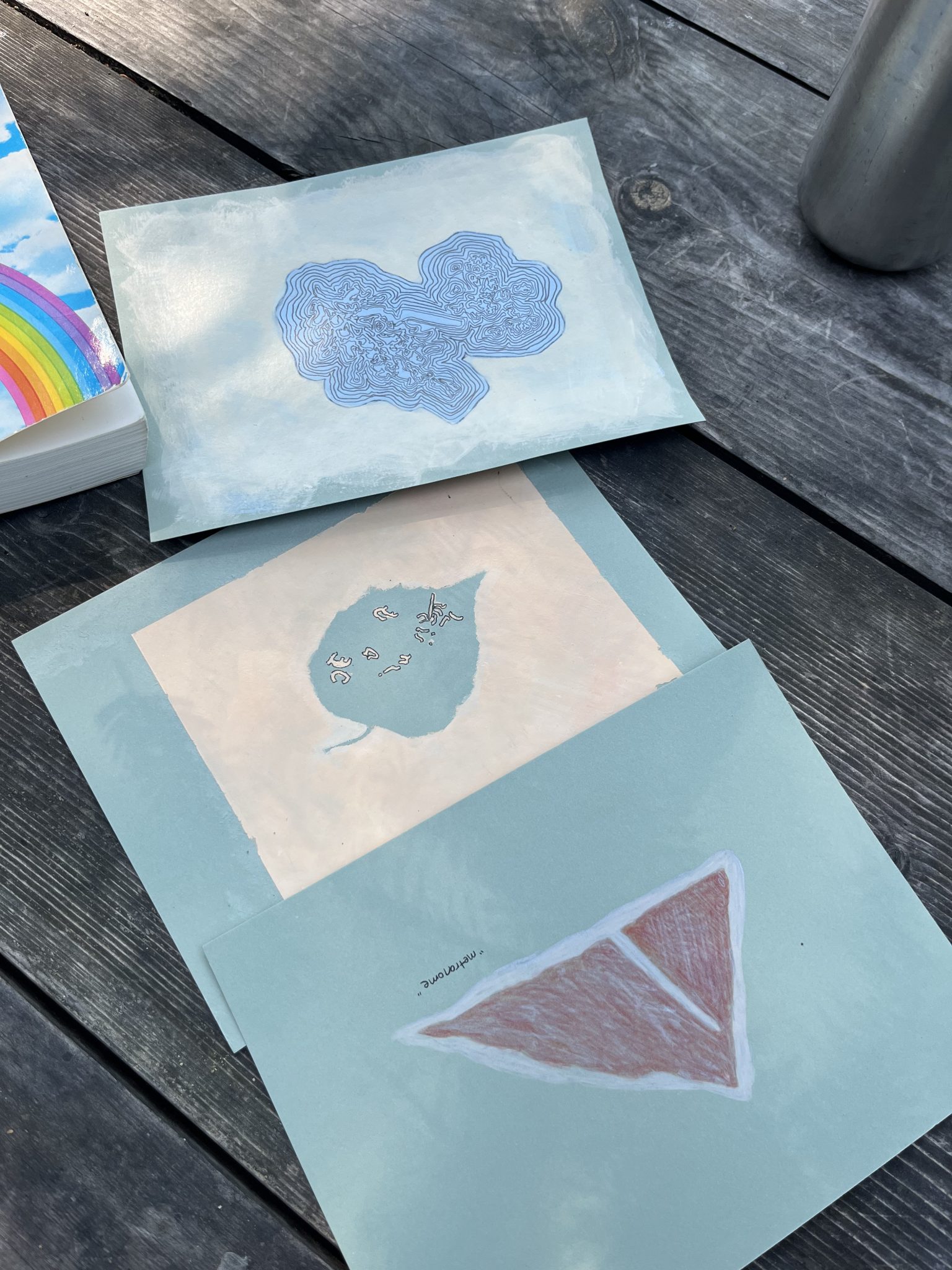
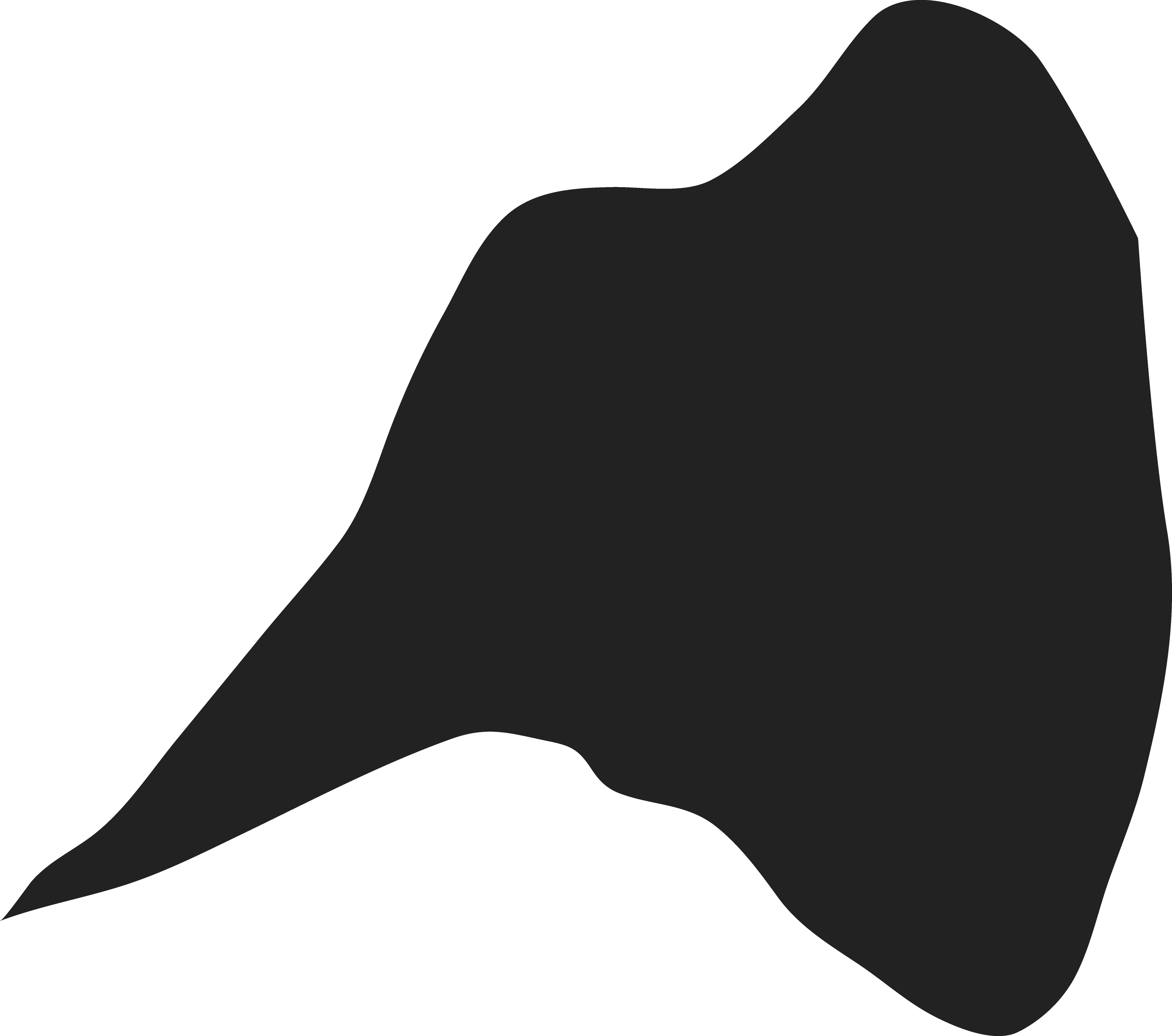
(1) the completed Rabbit Island font,
(2) an abstract typographic map of the island,
(3) a daily routine of light observation, and
(4) a design for a postcard accordion book.
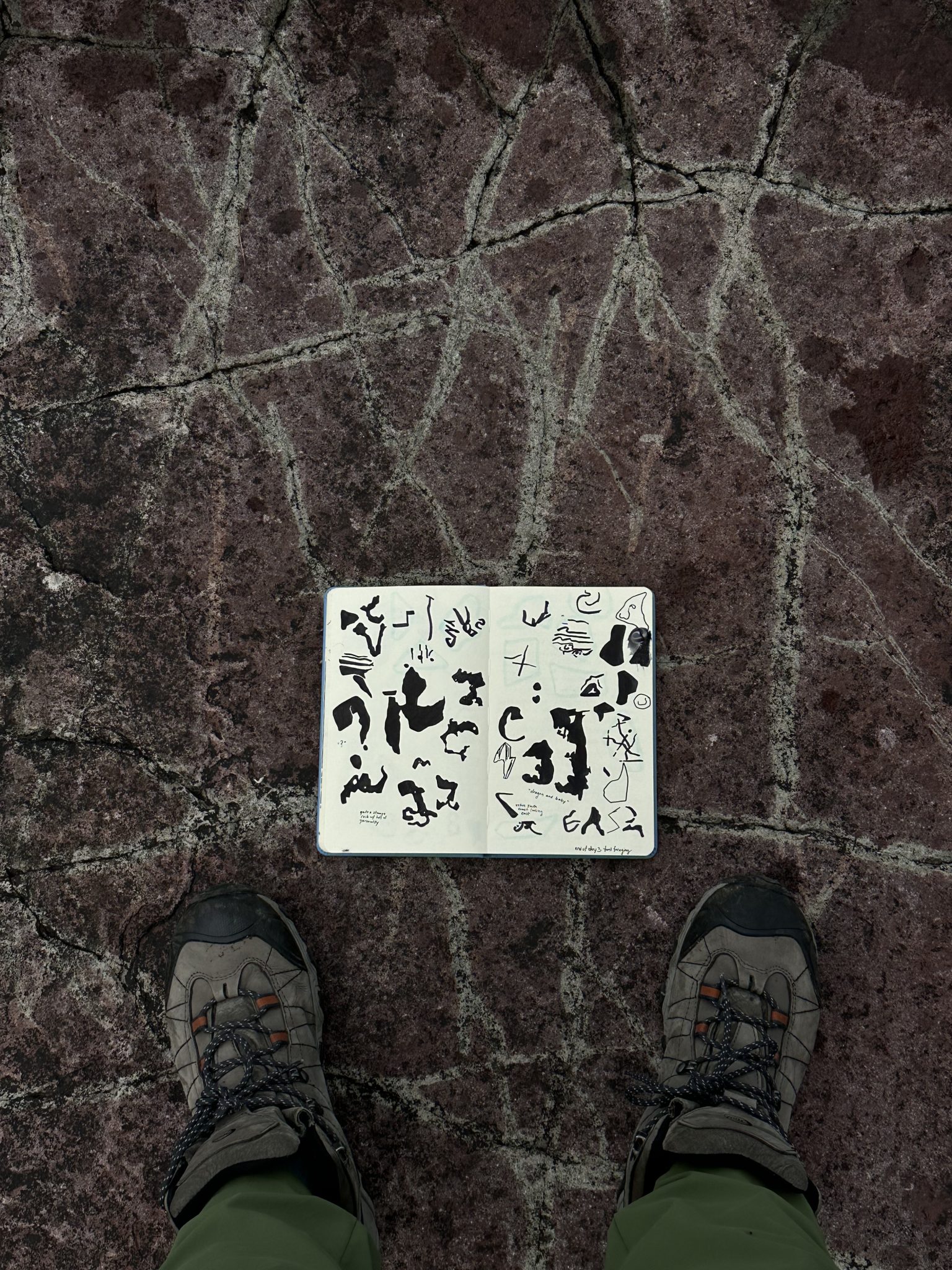
My continued Topography Typography practice has often used satellite imagery as a starting dataset from which I identify and curate geographic glyphs (geoglyphs) to form the basics of language for my place-based fonts. Often, the geoglyph boundaries I find are formed by human infrastructure.
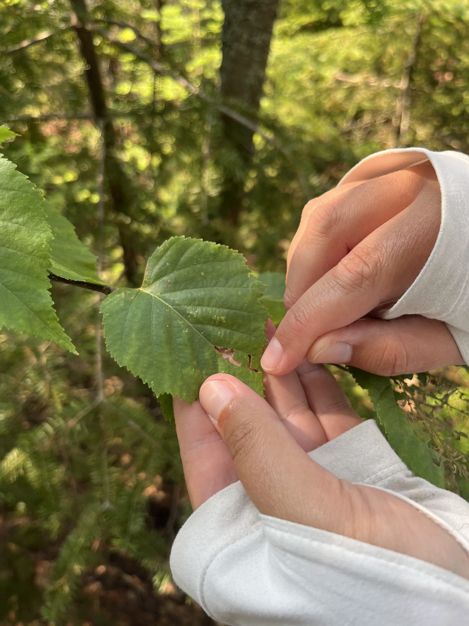
On Rabbit Island, I would like to take the chance to find the elements of language in a place without these artificial boundaries. While I may still use satellite imagery to inform my search, I would like to find my typographic shapes in-person, in-situ, and on the ground. While on the island, I’ll curate a batch of found letterforms formed by local nature and light. I’ll create a plein air study at the location of each geoglyph, twenty-six in total, one for each letter in the alphabet.
These studies will end up taking the form of a postcard accordion which will also include a collection of my written thoughts about light—from personal, historical, and scientific perspectives—typeset in Rabbit Island. By the end of the residency, I’ll have a prototype design for the postcard accordion with the intention to print and circulate the small book after the residency. Keeping an element of the referent landscape in the visual building blocks of language, the Rabbit Island font will allow this space’s unique topography to remain at the center of the published message.
By examining this landscape through the lens of the basics of language, I hope to build paths for folks to reflect on the importance of deep observation, nature conservation, and land stewardship.